
Why Video Work Instructions are a Bad Idea.
In this conversation with Daan Assen, we discover why video isn't the optimal medium for work instructions. (TL;DR Video work instructions are not scalable, complex to create, and difficult to update.)
Video: Great medium, wrong application.
Users often want to use videos for their work instructions to deliver knowledge on the shop floor. It makes sense.
Video seems like it would be a fantastic medium for work instructions. Videos are highly visual and they allow an expert to explain all the aspects and nuances of an instruction in real-time.
Perfect, right?
Not so fast!
Despite the many great qualities of videos, and the fact that they can be a great teaching tool if used correctly, video work instructions is not a great idea.
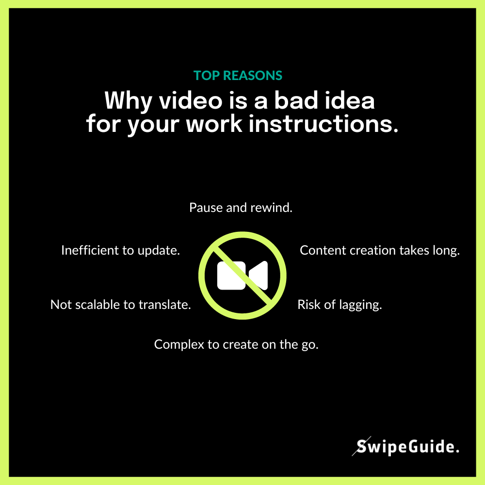
Top 5 reasons video work instructions is a bad idea:
- Video does not allow users to learn at their own pace (= pause and rewind)
- Not scalable to translate. Cumbersome to create a lot of content.
- If there's an update to an instruction, it's difficult to edit and update.
- Relatively complex to create on the go (needs editing, cutting, trimming)
- Videos are lagging if internet isn't 100%.

Let’s ask Daan.
To learn a bit more, I talked to SwipeGuide co-founder and resident instructional design wizard, Daan Assen.
Hey Daan, thanks for doing this. Can you tell me a bit about yourself and why SwipeGuide is such a great tool for learners?
Of course! I’m one of the co-founders of SwipeGuide, so I’ve been using my background in knowledge-management from the very beginning. It’s simply a great tool for putting knowledge in users’ pockets. Our guides are based on minimalist design principles, backed by research on how to make instruction more effective for everyone. We’ve embraced these evidence-based principles and made them one of the core aspects of our design.
Very cool. Every time I use SwipeGuide, I notice an emphasis on great visuals. Why is that?
Visuals are really, really important. People live in a visual context, and we have to remember that when we make user guides. Images are processed by our brains so much faster, like sixty thousand times faster, than text. It’s simply the most efficient way to deliver important ideas.
Also, images have much less ambiguity than text. An image makes it clear what a situation entails, and what needs to be done. And when we combine the efficiency and clarity of visuals with simple text, it’s a very powerful way to communicate.
Well, video is such a rich visual medium, and can deliver a lot of information. Doesn’t this mean that it would be great to use in a digital user guide?
You might think that, but it’s actually not the case. In general, instructional videos are great. It’s an effective medium for visually explaining concepts in depth. But when it comes to procedural knowledge, like how-to and step-by-step information for users, video work instructions has limitations.
The main problem with video is that it dictates the pace of learning for the user. Imagine that you have to explain a twelve-step procedure. In a video, once a viewer is at step five, they will probably not remember step one. With procedural knowledge, the user can decide the pace of their own learning and move through steps in a way that allows them to learn best. In a properly designed work instruction, users can easily swipe through steps at their own pace while performing the task in parallel. Therefore, it’s much more effective to use clear, still images or animated gifs because they make a much smaller impact on the pace of learning. video work instructions can't deliver that same impact.
That makes a lot of sense. I can imagine that video work instructions could present other problems for users as well.
Absolutely. Instructions should focus on simplicity and user-friendliness, and video can be quite a difficult format to work with for work instructions. Translating or captioning videos in different languages can be expensive and time consuming. You also have to consider the time it takes to create and edit a professional-quality video, not to mention the increased bandwidth needed to support such rich media.
Could you elaborate on what makes gifs so effective in user guides?
Sure! Gifs are great to use in situations where one image isn’t enough, like when you need to demonstrate a very specific movement. For example, turning a lever or nozzle in a very particular way. In this case, a short animated gif is very effective at capturing this motion without affecting the pace of the learner. An instructional video, even if it’s ten seconds long, creates an uncomfortable amount of waiting time in a user guide.
Conclusions.
- Work instructions should be simple and easy to create on the job.
- Instructions should use a combination of simple visuals and simple text.
- Procedural instructions must allow users to learn at their own pace.
- Video does not allow users to learn at their own pace.
- Instead of video, use simple images and gifs paired with text.
The takeaway is simple.
Stay away from using videos in your work instructions. Instead, use clear images and simple animated gifs to communicate effectively and to let users learn at their own pace.
Avoid video work instructions.
Read our extensive guide on how to create excellent digital work instructions here.
 ... also check out our summary of learner-focused instructional design principles.
About Daan Assen.
Daan is an entrepreneur who believes design can have an incredible impact on the way we learn. He’s used his expertise in instructional design to implement e-learning strategies in several multinationals over the years. He focuses on bringing research-proven minimalist design principles to facilitate digital transformation for enterprise solutions.
Author
Revisions
It's time to simplify frontline training
Work instructions, checklists, and skills management - all in SwipeGuide
- Cut training time by 50%
- SOC I and II compliant
Get to know us
SCHEDULE YOUR DEMOResources
-
1
How to empower your frontline with better instructional design. -
2
How to gain the edge in Industry 4.0 with smart manufacturing practices. -
3
How to make excellent digital work instructions. -
4
How to deliver continuous improvement at the frontline with Lean principles. -
5
How to capture, share, and improve expert knowledge with digital SOPs.


